Logos are like the outfit you put together for first impressions. Do you want to seem professional and clean, stoic and reliable, or fun and fresh? It’s the same idea with your logo, it’s the first visual image your customer’s see. What do you want your customers to think about your business?
There have been several studies in psychology about the effects of logo fonts on a  consumer’s psyche and impression of a business. In general, font designs influence viewers feelings and impressions of your brand. Some business look to other companies who specialize in design or hire their own to help create their one of a kind logo. So don’t just slap together a bunch of fonts and images to create something “pretty”, this is something worth taking the time to think about.
Here are some fundamental things to consider:
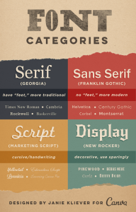
Basics: Each font has their own personality that in return will be reflected on to your business. Take a look at the infographic Canva has put together and you’ll see what we’re talking about.
Serif: Traditional, respectable, stable
Sans Serif: Simple, straightforward, sensible
Script: Personal, Feminine, Fancy
Display: friendly, quirky, unconventional
Modern: smart, trendy, forward thinking
Decorative: fun, unique, casual
Quick Tips:
#1 Familiar fonts build trust, and uniform fonts across multiple platforms create familiarity with the audience
#2 Fonts affect the senses: This Ted talk explains it pretty well! https://youtu.be/OXc-VZ4Vwbo
How to choose the right font design for your logo? Ask yourself the following:
What’s your business purpose and mood?
- Like we said earlier each font comes with their own personality and style. Do you want to bring up thoughts of summer and flowers or a finely pressed business suit?
- Pick the font that matches how you want to portray your business, but remember to also keep your target audience in mind.
To Match or To Contrast?
- A good combination can create a big impact.
- The trick is you either want to use the same font or use two completely different, but complementary, fonts. Using two fonts that are too similar in design will just create confusion, which you don’t want.
Experiment!
- You’ve probably found yourself stuck between a variety of fonts you feel fits well with your business and don’t know where to go from there, so now is the time to experiment.
- Try printing out examples and placing them where you’d put your logo and see how it looks.
- Ask family and friends for their input without giving them an explanation of your direction. This is a good way to test whether what they see matches what you were going for.
Get creative and keep trying!
- If you don’t fully love your design, keeping searching.
- Think outside of the box, your logo is meant to help you stand out.
- You can also get creative with placement, sizing and form…the possibilities are endless!
- Some businesses will go through a few logo changes, make sure to keep track of what works and what doesn’t, and keep trying until you find the golden ticket!
Need more advice on how to find the right logo design for your company? Media Monkey offers marketing consulting, Design and Social Media Managing. Give us a call at (630) 773-4402 or send us an email at [email protected]!
 1360 Hamilton Pkwy, Itasca, IL 60143
  (833) 454-4800


